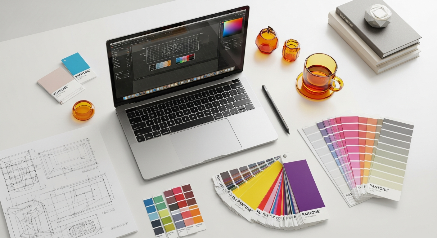
Skeleton Screens vs. Loading Spinners: Deciphering the Best Choice for Your UI
For years, the humble loading spinner has been the ubiquitous symbol of data retrieval or processing. It’s simple, universally understood, and easy to implement. However, with the evolution of design thinking and a deeper understanding of human psychology, a more sophisticated contender has emerged: the skeleton screen. This approach aims to make waiting less frustrating by providing context and a sense of progress.
But which method truly serves your users best? Is there a definitive winner, or do both have their rightful place in the UI designer’s toolkit? This comprehensive guide will dissect the nuances of skeleton screens and loading spinners, exploring their psychological impact, implementation considerations, and best-use cases. By the end, you’ll have a robust framework to confidently choose the most effective loading indicator for your specific design challenges, ensuring your users perceive your application as fast, responsive, and delightful.
Understanding the User Experience of Waiting
The act of waiting, particularly in a digital context, is inherently frustrating. Users come to your application with a specific goal, and any delay in achieving that goal can trigger negative emotions. As designers, we’re not just managing technical load times; we’re managing user perception of those load times. This distinction is crucial. A technically fast load can still feel slow if the user experience during the wait is poorly managed.
Jakob Nielsen’s seminal work on response times provides foundational guidelines that are still highly relevant today:
- 0.1 second: The limit for users feeling that the system is reacting instantaneously. This is where most UI animations and immediate feedback should occur.
- 1.0 second: The limit for the user’s flow of thought to stay uninterrupted. Beyond this, users notice the delay, though they might not perceive it as an interruption.
- 10 seconds: The absolute limit for keeping the user’s attention focused on the dialogue. Beyond this, users are likely to abandon the task, switch to something else, or leave the application entirely.
These thresholds highlight the critical importance of communicating progress effectively when delays are unavoidable. When an application takes longer than 1.0 second, users start asking, “Is it working? Did I click correctly? Is my internet connection fine?” An effective loading indicator answers these questions proactively, alleviating anxiety and maintaining trust.
The key here is “perceived performance.” It’s not just about how fast your application loads, but how fast users *think* it loads. A well-designed loading experience can make a 3-second wait feel shorter than a 1-second wait with a poor indicator. By providing visual feedback, we reduce uncertainty, give users a sense of control, and manage their expectations, all of which contribute to a more positive overall experience, even during delays.
The Case for Loading Spinners: Simplicity and Universality
Loading spinners, often referred to as throbbers, are animated graphical controls used to indicate that an application is performing an action in the background and that the user should wait. They typically consist of a rotating circle, a bouncing animation, or a progress bar that doesn’t explicitly state completion percentage. They are the classic “please wait” sign of the digital age.
What They Are and How They Work
A loading spinner is a simple, often repetitive animation that signals ongoing activity. When an application fetches data, processes a request, or transitions between states, a spinner appears to inform the user that their action has been registered and work is underway. Their primary function is to prevent users from thinking the application has frozen or crashed, thereby reducing frustration and preventing unnecessary clicks or refreshes.
Pros of Loading Spinners:
- Ease of Implementation: Spinners are relatively straightforward to add to any UI. Most UI frameworks and libraries provide ready-to-use components, minimizing development effort.
- Universally Understood: Almost every internet user, regardless of their background or digital literacy, recognizes a spinner as a sign of waiting. This widespread familiarity makes them a reliable choice for global audiences.
- Clear Indication of Processing: They unequivocally communicate that the system is busy. There’s little ambiguity about their purpose.
- Minimalist Design: A well-designed spinner can be subtle and unobtrusive, fitting seamlessly into various brand aesthetics without demanding too much attention.
- Suitable for Short Waits: For operations that typically complete within 1-2 seconds, a spinner is often perfectly adequate, as the user’s attention span isn’t significantly tested.
Cons of Loading Spinners:
- Can Feel Generic: Without context, a spinner can feel like a generic “empty state” that doesn’t provide any insight into *what* is loading or *how much* longer it might take.
- Highlights Actual Waiting Time: Because they offer no content preview, users are acutely aware of the passage of time. This can make even moderate waits feel longer.
- Doesn’t Convey Progress: A simple spinner doesn’t tell the user if the process is 10% or 90% complete, leading to uncertainty, especially for longer operations.
- Potential for Frustration: Staring at a perpetually spinning icon can be irritating, particularly if the wait is extended or unexpected. Users might wonder if the system is stuck.
- Lack of Content Context: Spinners provide no visual cues about the content that is about to appear, which can be jarring when the new content finally loads.
Best Use Cases for Loading Spinners:
You should lean towards using loading spinners in scenarios where:
- The loading time is expected to be very short (under 1-2 seconds).
- The action is simple and doesn’t involve fetching complex, structured data (e.g., submitting a form, toggling a setting).
- The content structure is highly variable or unpredictable, making a skeleton screen difficult to design.
- Implementation effort needs to be minimized due to time or resource constraints.
- You need a universal indicator that requires no prior explanation.
Industry standards like Google’s Material Design Guidelines for Progress Indicators offer clear advice on their use, often recommending them for indeterminate progress where the duration of a process is unknown. They emphasize that progress indicators should “inform users about the status of ongoing processes” and “reassure them that the application is working.”
Embracing Skeleton Screens: Perceived Performance and Content-Awareness
Skeleton screens represent a more modern and user-centric approach to managing loading states. Instead of a generic spinner, a skeleton screen provides a static or animated wireframe-like representation of the page content that is about to load. It’s essentially a blank version of the UI, with placeholder shapes for text, images, and other elements, mimicking the final layout.
What They Are and How They Work
A skeleton screen pre-renders the layout of your UI, filling it with subtle, neutral-colored shapes that correspond to where content will eventually appear. For instance, a news feed might show gray rectangles where article titles, images, and summaries will be. As data arrives, these placeholders are progressively replaced by actual content. The animation, often a subtle shimmer or pulse, gives the impression of content “streaming in.”
Pros of Skeleton Screens:
- Reduces Cognitive Load: By showing the structure of the page, skeleton screens give users an immediate mental model of what to expect. This reduces the cognitive effort required to process the incoming information once it loads.
- Creates a Sense of Progress: Even without actual data, the gradual filling of the skeleton shapes feels like progress. Users can anticipate the content, making the wait feel less ambiguous and more productive.
- Feels Faster (Perceived Performance): This is their greatest strength. By providing context and reducing uncertainty, skeleton screens make loading times *feel* shorter, even if the actual technical load time is the same as with a spinner. This aligns with Luke Wroblewski’s insights on perceived performance, where he advocates for “showing content as fast as possible.”
- Content-Aware and Contextual: Unlike a generic spinner, a skeleton screen is tailored to the specific content being loaded. This provides valuable context and helps users understand what they are waiting for.
- Better for Complex Layouts: For data-rich interfaces like dashboards, social feeds, or e-commerce product pages, skeleton screens shine. They gracefully handle the staggered loading of different components without jarring layout shifts.
Cons of Skeleton Screens:
- More Complex to Implement: Designing and implementing skeleton screens typically requires more effort than a simple spinner. You need to create placeholder UI for every unique layout or component.
- Can Be Jarring If Not Well-Designed: If the transition from skeleton to actual content is abrupt or poorly animated, it can be distracting or even frustrating, leading to “layout shifts” that negatively impact user experience (and Core Web Vitals).
- Not Always Suitable for Highly Dynamic Content: If your content structure varies wildly or is completely unpredictable, designing a representative skeleton can be challenging or even misleading.
- Potential for Over-design: Overly detailed or animated skeleton screens can sometimes draw too much attention, becoming a distraction rather than a helpful placeholder.
Best Use Cases for Skeleton Screens:
Consider skeleton screens for:
- Applications with complex, structured layouts (e.g., social media feeds, news sites, e-commerce product listings, dashboards).
- Scenarios where loading times are expected to be moderate to long (2 seconds or more).
- When you want to prioritize perceived performance and user delight.
- Interfaces where providing context about the incoming content is beneficial.
- Mobile applications where network conditions can be variable, leading to longer load times.
The principle behind skeleton screens is rooted in giving users a sense of progress and anticipation rather than leaving them staring at an empty void. This proactive approach significantly enhances the user’s perception of speed and responsiveness.
Beyond the Basics: Implementation Considerations for Both
Choosing between a spinner and a skeleton screen is just the first step. Effective implementation is crucial to ensure these indicators genuinely enhance the user experience rather than add to the frustration. Here are key considerations for both approaches:
For Loading Spinners:
- Animation Speed: A spinner should animate smoothly and at a moderate pace. Too fast, and it can feel frantic; too slow, and it might appear stuck. The animation should convey activity without being aggressive.
- Placement and Size: Position the spinner centrally within the area it’s loading or near the element triggering the action. It should be noticeable but not dominant. Material Design often suggests placing them in the center of the screen for full-page loads or within specific components.
- Accompanying Text: For longer waits or complex operations, pair the spinner with concise, informative text like “Loading data…” or “Processing your request…” This adds clarity and context.
- Indeterminate vs. Determinate: Most spinners are indeterminate (they don’t show specific progress). If you have a clear progression (e.g., uploading a file), a determinate progress bar (showing percentages) is usually more appropriate.
- Delay Before Showing: For very brief operations (under 0.5-1 second), it’s often better to show nothing at all. Flashing a spinner for a split second can be more jarring than simply waiting for the content to appear. This “threshold” approach prevents unnecessary UI changes.
For Skeleton Screens:
- Granularity and Fidelity: The skeleton should mimic the basic structure of your content without being overly detailed. Use simple shapes for text lines, images, and interactive elements. Avoid trying to replicate exact font sizes or intricate iconography; focus on the overall layout.
- Animation (Pulsing/Shimmering): A subtle animation, such as a gentle pulse or a “shimmer” effect (a light wave passing across the placeholders), enhances the sense of activity and prevents the screen from looking frozen. Ensure the animation is smooth and not distracting.
- Matching Content Structure: The skeleton must accurately represent the eventual layout. If your content loads in a grid, the skeleton should show a grid of placeholders. Inconsistencies can lead to a jarring experience when content replaces the skeleton.
- Avoiding Excessive Detail: Don’t try to make the skeleton too realistic. Its purpose is to provide structure, not to preview content. Over-detailing can lead to visual clutter and increase implementation complexity.
- Transition to Content: The transition from skeleton to actual content should be smooth. Fade in the content, or replace placeholders incrementally as data becomes available. Avoid abrupt “pops” of content.
- Accessibility (WCAG Considerations):
- Ensure sufficient color contrast for the skeleton elements against the background (WCAG 2.1 AA minimum).
- For users with screen readers, the dynamic nature of content appearing can be problematic. Consider using ARIA live regions (e.g.,
aria-live="polite") to announce when new content has loaded, or provide an off-screen text alternative that indicates loading. - Be mindful of animations for users with motion sensitivity. Provide an option to reduce motion if your skeleton animation is prominent.
Ultimately, the best implementation for both methods involves careful consideration of timing, visual design, and user context. Test your loading indicators with real users to gauge their effectiveness and identify any areas for improvement.
The Psychology of Perception: Why Skeleton Screens *Feel* Faster
The core reason skeleton screens are often lauded for superior perceived performance lies deep in human psychology and our cognitive biases. It’s not magic; it’s a clever manipulation of how our brains process information and time.
Reducing Uncertainty and Providing Context
When users stare at a blank screen or a generic spinner, they are in a state of uncertainty. They don’t know if the system is working, what it’s working on, or how long it will take. This uncertainty is a major source of anxiety and makes time feel longer. Our brains are wired to dislike ambiguity.
Skeleton screens counteract this by providing immediate context. Even without actual content, the structured placeholders tell the user: “This is what’s coming. This is the layout of the page.” This mental model reduces cognitive load and gives the user something to focus on, shifting their attention from the passage of time to the anticipation of content. It transforms a blank void into a meaningful placeholder.
The Illusion of Progress
Humans are goal-oriented creatures. We find satisfaction in seeing progress towards a goal. A spinner, while indicating activity, doesn’t convey progress. It’s an indeterminate loop. A skeleton screen, however, with its gradual filling of content, creates a powerful illusion of progress. Each placeholder that gets replaced by actual data feels like a step forward, a mini-completion. This psychological trick makes the overall waiting period feel more productive and therefore shorter.
The “Optimistic UI” Principle
Skeleton screens align with the principle of “optimistic UI,” where the interface provides immediate feedback, often assuming success, even before a server response is fully confirmed. While not strictly optimistic in the sense of showing *completed* actions, skeleton screens are optimistic about the *arrival* of content. They confidently display the structure that *will* be filled, rather than passively waiting. This proactive approach contributes to a feeling of responsiveness and control for the user.
Minimizing the “Blank Slate” Effect
A blank screen, even with a spinner, can feel like an empty canvas, highlighting the absence of information. This “blank slate” effect can be jarring and emphasize the wait. Skeleton screens, by contrast, immediately fill the canvas with meaningful (albeit placeholder) structure. This avoids the stark emptiness and makes the transition to full content feel less abrupt and more integrated.
In essence, skeleton screens succeed because they address the psychological aspects of waiting: they reduce uncertainty, provide context, create an illusion of progress, and leverage our natural tendency to anticipate. By managing perception, they transform potentially frustrating waits into more tolerable, even engaging, interludes.
Accessibility (WCAG) and Inclusivity in Loading States
When designing loading indicators, accessibility is not an afterthought; it’s a fundamental requirement. Ensuring that users with disabilities can understand and interact with your loading states is crucial for creating an inclusive experience. The Web Content Accessibility Guidelines (WCAG) provide a robust framework for achieving this.
Key WCAG Principles for Loading States:
- Perceivable (Principle 1): Information and user interface components must be presentable to users in ways they can perceive.
- Color Contrast (WCAG 1.4.3): If your spinner or skeleton screen uses color, ensure sufficient contrast between the loading indicator and its background. This is particularly important for users with low vision or color blindness. Aim for at least a 4.5:1 contrast ratio for normal text/graphics.
- Non-Text Content (WCAG 1.1.1): If a loading spinner is purely decorative and its meaning is conveyed by surrounding text (e.g., “Loading…”), it might not need extensive alt text. However, if it’s the *only* indicator, ensure its purpose is programmatically determinable.
- Operable (Principle 2): User interface components and navigation must be operable.
- Keyboard Accessibility: Ensure that focus management during loading states is handled gracefully. If a new component loads, focus should be managed to avoid trapping users or losing their place.
- Motion (WCAG 2.3.3): Animations, especially those that involve flashing or rapid movement, can trigger seizures or cause discomfort for users with vestibular disorders.
- Avoid anything flashing more than three times in any one-second period.
- For skeleton screen shimmer effects or complex spinner animations, consider providing a user preference (e.g., via
prefers-reduced-motionmedia query) to offer a static version or a less intense animation.
- Understandable (Principle 3): Information and the operation of user interface must be understandable.
- Predictability (WCAG 3.2): Loading indicators should behave predictably. They should appear when content is loading and disappear when it’s ready, without unexpected changes in context.
Specific Accessibility Techniques for Loading Indicators:
- ARIA Live Regions: For dynamic content loading, especially with skeleton screens or when new content replaces a spinner, use ARIA live regions.
- Wrap your loading message or the container that will hold the new content with
aria-live="polite"andaria-atomic="true". This tells screen readers to announce changes to this area without interrupting the user’s current task. - Example:
<div role="status" aria-live="polite">Loading new articles...</div>. Once loaded, replace this text with the actual content or update the live region to announce “Articles loaded.”
- Wrap your loading message or the container that will hold the new content with
- Role=”status” or Role=”alert”: Use
role="status"for general, non-interruptive updates (like a loading message). Userole="alert"for urgent, time-sensitive information that requires immediate attention. - Focus Management: When a new section of content loads, ensure that the keyboard focus doesn’t get lost or jump to an unexpected location. Consider directing focus to the newly loaded content or a logical point within it.
- Text Alternatives: Always provide text alternatives for purely visual loading indicators. For a spinner, this might be an off-screen “Loading…” text that screen readers can pick up. For skeleton screens, the ARIA live region approach is generally more effective for communicating the *state* of loading.
By integrating accessibility considerations from the outset, you ensure that your loading experiences are not only smooth and fast for the majority but also inclusive and usable for everyone.
Making the Right Choice: A Decision Framework
The “best” loading indicator isn’t a one-size-fits-all solution. It’s a strategic decision informed by several factors related to your application, its users, and the context of the loading event. Here’s a framework to guide your choice:
Factors to Consider:
- Complexity of Content:
- Simple/Monolithic: If you’re loading a single image, a small snippet of text, or submitting a basic form, a spinner might suffice.
- Complex/Structured: For data-rich pages with multiple distinct components (e.g., profiles, dashboards, article feeds), a skeleton screen is usually superior as it provides structure and context.
- Expected Loading Time:
- Very Short (0-1 seconds): Often, no indicator is needed. If you must, a quick spinner is acceptable.
- Short to Moderate (1-3 seconds): A spinner can work, but a skeleton screen will likely provide a better perceived experience, especially if the content is complex.
- Moderate to Long (3+ seconds): Skeleton screens are strongly recommended. A spinner for this duration can be highly frustrating. Consider adding a progress bar for very long, determinate operations.
- User Context and Expectations:
- Familiar Users: Users familiar with your app might tolerate a spinner for a known short wait.
- New Users: Skeleton screens can help new users quickly understand your app’s layout and content structure.
- Critical Tasks: For tasks where users are highly focused or anxious (e.g., financial transactions), clear communication of progress is paramount.
- Implementation Effort and Resources:
- Low Effort: Spinners are quick and easy to implement.
- Higher Effort: Skeleton screens require more design and development time, especially for multiple unique layouts. Evaluate if the UX benefit outweighs the cost.
- Brand Identity and Aesthetic:
- Minimalist/Functional: A clean spinner might align with a very utilitarian brand.
- Modern/User-Centric: Skeleton screens often convey a more modern, thoughtful, and user-friendly aesthetic.
When to Use Loading Spinners:
- For very quick, indeterminate actions where content structure is irrelevant (e.g., “saving settings,” “sending message”).
- Within components that have a very small area to load, and a skeleton would be too granular or complex to design effectively.
- As a fallback for very simple data fetches where a full skeleton screen is overkill.
- When development resources are extremely limited and a quick, universal solution is needed.
When to Use Skeleton Screens:
- For full-page loads or significant section loads, especially where content is complex and structured (e.g., feeds, product pages, dashboards).
- When loading times are expected to be noticeable (over 1.5-2 seconds).
- To enhance perceived performance and reduce user frustration during data fetching.
- In mobile applications where network latency can vary significantly.
- For a more polished, modern, and user-centric brand image.
Sometimes, a hybrid approach is best. You might use a skeleton screen for the main content area, but a small spinner within a specific widget that loads independently and very quickly. The key is thoughtful application based on context.
Advanced Techniques and Hybrid Approaches
The choice between a skeleton screen and a loading spinner doesn’t have to be binary. Savvy designers often combine these techniques or employ more advanced strategies to create truly seamless loading experiences.
Combining a Subtle Spinner Within a Skeleton
For components within a skeleton that might take slightly longer to load or have a very specific data fetch, you can place a tiny, subtle spinner within that particular placeholder. This indicates that *that specific part* is still processing, even as other parts of the skeleton are filling in. This provides granular feedback without reverting to a full-page spinner.
Progress Bars for Long Operations
For operations with a known duration or a clear progression (e.g., file uploads, multi-step forms, large data imports), a determinate progress bar is often superior to both spinners and skeletons. It provides explicit numerical feedback (e.g., “75% complete”) which significantly reduces anxiety and offers a clear expectation of completion. Nielsen Norman Group often advocates for determinate progress indicators when feasible.
Lottie Animations and Custom Loading States
For a more branded and engaging loading experience, consider using custom animations created with tools like Lottie. These lightweight, scalable animations can be integrated easily and offer immense creative freedom. They can range from subtle brand-specific loaders to playful micro-interactions that distract users from the wait. However, ensure they remain accessible and don’t introduce excessive motion for sensitive users.
The Role of Pre-fetching and Caching in Reducing Perceived Loading
The best loading indicator is often no loading indicator at all. This is achieved through optimizing actual load times via:
- Pre-fetching: Anticipating user actions and pre-loading data or resources before they are explicitly requested. For example, pre-fetching the next page in a sequence.
- Caching: Storing frequently accessed data or content locally so it can be retrieved instantly on subsequent visits.
- Lazy Loading: Loading only the content that is immediately visible to the user, and deferring the loading of off-screen content until it’s needed.
- Content Delivery Networks (CDNs): Distributing assets globally to reduce latency.
While these are technical optimizations, they directly impact the UI/UX by reducing the need for any loading indicators, or by making the periods they appear much shorter.
Instant Gratification and Optimistic UI
For actions like “liking” a post or adding an item to a cart, consider an “optimistic UI” approach. Show the action as completed instantly on the client side, even before the server confirms it. If the server call fails, then display an error message. This provides immediate feedback and a feeling of responsiveness, as popularized by services like Facebook.
By thoughtfully applying these advanced techniques and understanding the underlying principles, you can craft loading experiences that not only manage expectations but actively enhance user satisfaction, turning potential moments of frustration into opportunities for delight.
Comparison Table: Spinners vs. Skeleton Screens
| Feature | Loading Spinner | Skeleton Screen |
|---|---|---|
| Perceived Speed | Can make waits feel longer due to lack of context. | Makes waits feel shorter by providing structure and progress. |
| Implementation Complexity | Low; often built-in components. |