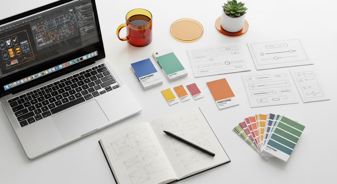
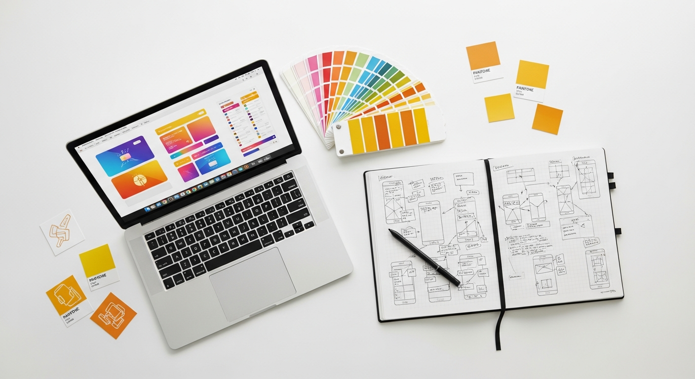
Streamlining Design Consistency: Essential Linting Tools for Your UI/UX Library
Enter design linting. Much like code linting helps developers maintain clean, consistent, and error-free codebases, design linting offers a proactive solution for designers. It’s an automated guardian, constantly checking your design files against your design system’s rules, catching inconsistencies before they escalate into significant rework or compromise user experience. This article will delve into what design linting entails, why it’s indispensable for modern design teams, explore key tools, and guide you through integrating it into your workflow to maintain unparalleled library consistency.
What is Design Linting and Why Does It Matter So Much?
At its core, design linting is the automated process of analyzing your design files to flag inconsistencies or deviations from a predefined set of rules and standards. Think of it as a spell checker, but for your design system. Instead of checking for misspelled words, it checks for incorrect color usage, inconsistent typography, non-standard spacing, or improperly used components. It’s a systematic approach to enforcing your design system’s guidelines programmatically.
Why is this automation so critical for your UI/UX library? The reasons are multifaceted and deeply impact efficiency, quality, and collaboration:
- Ensures Unwavering Consistency: This is the primary benefit. Linting guarantees that every designer on your team adheres to the same visual language, whether it’s the exact shade of a primary color, the specific font weight for a heading, or the padding around a button. This consistency is vital for building trust with users and reinforcing brand identity. As highlighted by the Nielsen Norman Group’s heuristic of “Consistency and Standards,” users expect similar elements to behave similarly, reducing cognitive load and improving learnability.
- Reduces Manual Errors and Rework: Relying on manual checks during design reviews is time-consuming and prone to human error. Linting tools catch these mistakes instantly, saving countless hours that would otherwise be spent identifying, communicating, and fixing issues later in the design or development cycle.
- Speeds Up Design Reviews and Approvals: With automated checks handling the grunt work of consistency validation, design reviews can focus on higher-level strategic decisions, user experience flows, and creative problem-solving, rather than nitpicking pixel perfect details.
- Improves Collaboration Between Designers and Developers: A consistent design library translates directly into a more predictable and efficient development process. When designs adhere strictly to the design system, developers can confidently build components that mirror the design, minimizing back-and-forth communication and reducing the likelihood of “design drift” during implementation. This tight alignment is fundamental for agile teams.
- Upholds Design System Integrity: Your design system is an investment. Linting acts as a gatekeeper, protecting that investment by ensuring that all new designs and updates remain true to its established principles and components. It prevents the dilution of your design language over time.
- Facilitates Accessibility Compliance: Many linting tools can automatically check for critical accessibility standards, such as color contrast ratios (e.g., WCAG 2.1 AA or AAA), minimum tap target sizes, and proper text scaling. Integrating these checks early in the design process helps build inclusive products from the ground up, rather than retrofitting accessibility later.
In essence, design linting elevates your design system from a static documentation tool to a dynamic, enforced framework, empowering your team to build better, faster, and more consistently.
The Core Principles Behind Effective Design Linting
To truly leverage the power of design linting, it’s essential to understand the underlying principles that make it effective. These principles guide not only the selection of tools but also the strategy for integrating linting into your design workflow.
- Define Clear and Comprehensive Rules: The effectiveness of any linting system hinges on the clarity and completeness of its rules. Before you even think about tools, you must have a well-documented design system that explicitly outlines:
- Visual Styles: Exact hex codes for colors, specific font families, sizes, weights, line heights, and letter spacing for typography, and defined values for spacing (e.g., an 8pt grid system).
- Component Usage: How components should be used, their allowed variations, states, and proper nesting.
- Naming Conventions: Standardized naming for layers, frames, styles, and components (e.g., using BEM methodology for component names or PascalCase for styles).
- Accessibility Standards: Minimum contrast ratios, text sizes, and interactive area sizes.
These rules should ideally be derived from your design system’s core principles, similar to how Material Design principles guide their extensive component library.
- Seamless Integration into Your Workflow: Linting shouldn’t feel like an extra burden. It should integrate naturally into your existing design process. This means choosing tools that work with your primary design software (Figma, Sketch, Adobe XD) and ideally provide feedback in real-time or as part of a regular check-in process (e.g., before publishing a component to a shared library).
- Automation as a Priority: The goal of linting is to automate repetitive, rule-based checks. If your linting process requires significant manual intervention for every design file, you’re missing the core benefit. Seek tools that can run checks automatically and provide instant, actionable feedback.
- Actionable and Timely Feedback: When an inconsistency is detected, the linting tool should provide clear, concise, and actionable feedback. It shouldn’t just say “error”; it should specify *what* the error is, *where* it is, and ideally, *how to fix it* or point to the relevant design system documentation. The feedback should be delivered as close to the point of creation as possible to enable immediate correction.
- Scalability and Customization: Your linting solution should be able to scale with your team and your design system. As your design system evolves, you should be able to easily update, add, or remove linting rules. The ability to customize rules to fit the unique nuances of your brand and product is crucial.
- Education and Adoption: Even the best linting tools are ineffective if the team doesn’t understand or adopt them. Clear communication, training, and documentation on how to use the tools and interpret their feedback are paramount. Foster a culture where linting is seen as a helpful assistant, not a restrictive overlord.
By adhering to these principles, you can build a robust linting strategy that truly empowers your design team and reinforces the integrity of your UI/UX library.
Key Areas Where Design Linting Shines
Design linting isn’t a one-size-fits-all solution; it excels in specific areas where consistency is paramount and manual checks are error-prone. Understanding these areas will help you prioritize your linting rules and maximize the impact of your tools.
1. Visual Consistency
This is arguably the most recognized strength of design linting, directly addressing the aesthetic harmony of your product.
- Color Palette Adherence: Linting ensures that only approved colors from your design system’s palette are used. This means checking for specific hex codes, RGB values, or more commonly, ensuring that color styles are linked to defined color tokens or variables. It prevents designers from introducing “off-brand” colors or slightly varying shades.
- Typography Scales: Consistency in typography is crucial for readability and brand identity. Linting verifies that all text elements (headings, body text, captions) use the correct font families, sizes, weights, line heights, and letter spacing as defined in your system. It can flag instances where a designer manually sets a font size instead of using a predefined text style.
- Spacing Systems: Whether you adhere to an 8pt grid, a 4pt grid, or a custom spacing scale, linting can check the distances between elements, padding within components, and margins. This ensures visual rhythm and predictable layouts across your product.
- Iconography: Linting can verify that icons adhere to specific size constraints, stroke weights, and overall style guidelines, preventing a disparate collection of icons from appearing in your UI.
2. Component Usage and Structure
For design systems built on reusable components, linting is indispensable for maintaining their integrity.
- Correct Component Instances: Linting checks if designers are using instances of master components from your library rather than detached, modified copies. This is critical for centralized updates and ensuring consistency.
- Proper Overrides vs. Detached Components: While flexibility is good, excessive detachment can break the system. Linting can highlight instances where components have been detached from their master, prompting a review to see if a new component variant is needed or if it was an oversight.
- State Management: Linting can verify that components are used with their intended states (e.g., a button in an ‘enabled’ state should not have the styling of a ‘disabled’ state).
- Layer Structure and Naming: It can enforce consistent naming conventions for layers and groups within components, making handoff to developers much clearer and reducing potential confusion.
3. Accessibility Compliance
Building accessible products is not just a best practice; it’s often a legal requirement. Linting can automate crucial accessibility checks.
- Color Contrast: This is a major one. Linting tools can automatically check the contrast ratio between text and its background, flagging combinations that do not meet WCAG 2.1 AA or AAA standards. This prevents accessibility issues for users with visual impairments.
- Minimum Tap Targets: For interactive elements, linting can ensure that buttons, links, and other interactive areas meet minimum size requirements for touch interaction, as recommended by accessibility guidelines.
- Text Readability: While not a direct linting check, some tools can identify text that might be too small or too tightly spaced for optimal readability, pushing designers to adhere to minimum font sizes.
4. Naming Conventions
A well-organized design file is a joy to work with. Linting can enforce naming conventions for:
- Layers and Frames: Consistent naming (e.g.,
Header/Title,Button/Primary/Enabled) makes files easier to navigate for both designers and developers. - Styles: Ensuring color styles, text styles, and effect styles follow a predefined structure (e.g.,
Brand/Primary/500,Text/Heading/H1).
5. Dev Handoff Readiness
Ultimately, designs need to be built. Linting helps ensure that what designers produce can be efficiently translated into code.
- Matching Code Components: Advanced linting can potentially cross-reference design components with their corresponding code components in a Storybook or component library, flagging discrepancies.
- Ensuring “Design System Only” Usage: Preventing ad-hoc styles or components from being used that don’t exist in the shared design system helps prevent a fragmented codebase.
By focusing on these key areas, design linting becomes a powerful ally in building robust, accessible, and maintainable UI/UX libraries.
Popular Design Linting Tools and Their Features
The landscape of design linting tools is constantly evolving, with new plugins and platforms emerging to address the growing need for design system consistency. Your choice of tool will largely depend on your primary design software, team size, and specific needs. Here’s a look at some prominent options and their capabilities:
Figma-Specific Plugins
Figma’s robust plugin ecosystem makes it a fertile ground for linting tools.
- Design Lint (by Shopify/Microsoft): This is one of the most comprehensive linting plugins for Figma. It allows you to define rules for colors, typography, effects, spacing, layer naming, component usage, and more. It can scan your entire file or selected frames and provides a detailed list of issues with suggestions for correction. It’s highly customizable, allowing you to tailor rules to your specific design system.
- Styler: Primarily focused on styles, Styler helps you identify and replace local styles with published library styles. It’s excellent for ensuring that all text and color properties are linked to your design system’s defined styles, preventing orphaned or unmanaged styles.
- Contrast: A dedicated accessibility tool, Contrast checks the contrast ratio of text and other elements against WCAG standards directly within your Figma file, offering quick feedback and suggestions for compliance.
- Specll: While not strictly design linting, Specll is a valuable plugin for spell-checking text layers in Figma, ensuring textual consistency and professionalism.
Sketch Plugins
Sketch has a long history of plugin development, and several options cater to linting needs.
- Linter: A general-purpose Sketch plugin that allows you to define rules for text styles, layer naming, color usage, and more. It helps maintain consistency across your Sketch files and libraries.
- Sketch Measure: While primarily a spec-generating tool, it indirectly contributes to consistency by ensuring all measurements and spacing are clearly defined and consistent with developer handoff expectations.
Standalone/Cross-Platform Solutions
These tools often integrate with multiple design software or operate as part of a broader design system management platform.
- Supernova: A comprehensive design system management platform that includes robust linting capabilities. Supernova can connect to your Figma, Sketch, or Adobe XD files, extract design tokens, and apply linting rules to ensure consistency across your entire system, from design to code. It’s excellent for large organizations aiming for a single source of truth.
- Specify: A design data platform that helps you centralize, distribute, and update design tokens and assets. It includes features for ensuring style consistency by providing a single source for design data that all tools can pull from.
- Chromatic (for Storybook): While primarily a visual regression testing tool for UI components (often integrated with Storybook), Chromatic acts as a form of linting. It captures snapshots of your UI components and flags any visual changes, ensuring that component updates don’t introduce unintended inconsistencies or breaks. This is crucial for maintaining a consistent component library at the code level.
- Frontify / Zeroheight / Brandfetch: These are design system documentation platforms that often have auditing or “health check” features. While not always real-time linting within design files, they can analyze your published components and styles to identify inconsistencies or deviations from documented standards.
Comparison Table: Design Linting Tools at a Glance
To help you compare, here’s a table outlining some key aspects of popular design linting solutions:
| Tool Name | Primary Platform(s) | Primary Focus | Key Features | Best For |
|---|---|---|---|---|
| Figma Design Lint | Figma | Comprehensive Design System Consistency | Color, typography, spacing, layer naming, component usage checks; highly customizable rules; real-time feedback. | Figma-centric teams needing deep, customizable linting within their design files. |
| Figma Styler | Figma | Style Management & Cleanup | Identifies and replaces local styles with library styles; cleans up unused styles. | Ensuring all styles adhere to the design system’s published styles. |
| Figma Contrast | Figma | Accessibility Compliance | WCAG color contrast checks for text and elements; offers suggestions for compliance. | Designers prioritizing accessibility and WCAG standards. |
| Supernova | Multi-platform (Figma, Sketch, Adobe XD) | Design System Management & Consistency | Centralized design tokens, automated documentation, cross-platform linting, code export. | Large teams, complex design systems, and those needing a single source of truth across design and code. |
| Chromatic | Storybook (Code) | Visual Regression Testing (Code Components) | Automated visual testing of UI components; flags visual discrepancies upon code changes. | Teams with a strong Storybook component library, ensuring visual consistency at the code level. |
When selecting a tool, consider how it integrates with your current software, the level of customization it offers, and whether it addresses the specific consistency challenges your team faces.
Implementing Design Linting into Your Workflow
Integrating design linting isn’t just about picking a tool; it’s about establishing a process that seamlessly incorporates automated checks into your existing workflow. Here’s a step-by-step guide to help you get started:
Step 1: Audit Your Existing Design System and Files
Before you can enforce consistency, you need to understand your current state.
- Identify Inconsistencies: Manually (or with initial linting runs) audit your existing design files. Look for variations in colors, fonts, spacing, and component usage that don’t align with your documented design system.
- Review Documentation: Ensure your design system documentation is up-to-date, clear, and comprehensive. Outdated or ambiguous rules will lead to ineffective linting.
Step 2: Define Your Linting Rules
Based on your audit and design system documentation, explicitly define the rules you want your linting tool to enforce.
- Prioritize Critical Rules: Start with the most impactful rules – typically those related to core visual identity (colors, typography, spacing) and accessibility (contrast ratios).
- Document Rules Clearly: For each rule, specify what it checks for, why it’s important, and how designers should adhere to it. Link these rules back to your design system documentation.
- Consider Naming Conventions: Define strict naming conventions for layers, frames, and components. This is often overlooked but crucial for organization and developer handoff.
Step 3: Choose the Right Tools for Your Team
Refer to the comparison table and your team’s specific needs to select the best linting solution.
- Compatibility: Does it integrate with your primary design software (Figma, Sketch, Adobe XD)?
- Customization: Can you tailor the rules to match your unique design system?
- Scope: Do you need comprehensive linting, or are you focused on specific areas like accessibility or style cleanup?
- Scalability: Can the tool grow with your team and design system?
Step 4: Integrate into Your Design Process
Embed linting checks at strategic points in your workflow.
- Real-time Feedback (Plugins): For tools like Figma’s Design Lint, encourage designers to run checks frequently during their design process, providing immediate feedback.
- Pre-Publish Checks: Before publishing new components or updates to your shared UI/UX library, mandate a linting run. This acts as a gatekeeper for your design system.
- Automated Design Reviews: Integrate linting into your design review process. The tool can identify superficial inconsistencies, allowing human reviewers to focus on UX, strategy, and creativity.
- CI/CD for Design Systems: For advanced teams, consider integrating linting into a continuous integration/continuous deployment (CI/CD) pipeline for your design system. This can automatically run checks whenever changes are pushed to your design system files or code, blocking non-compliant updates.
Step 5: Educate Your Team and Foster Adoption
Technology alone isn’t enough; people need to embrace it.
- Training Sessions: Conduct workshops to introduce the chosen linting tools, explain the rules, and demonstrate how to interpret and act on feedback.
- Clear Documentation: Provide easily accessible documentation on how to use the linting tools, troubleshoot common issues, and understand the rationale behind specific rules.
- Emphasize Benefits: Frame linting as a helpful assistant that frees up time and improves quality, rather than a restrictive set of rules.
Step 6: Iterate and Refine
Your design system is a living entity, and so should be your linting strategy.
- Regularly Review Rules: As your design system evolves, review and update your linting rules to reflect new components, styles, or accessibility requirements.
- Gather Feedback: Solicit feedback from your design team on the effectiveness of the tools and rules. Are they too strict? Not strict enough? Are there false positives?
- Monitor Impact: Track metrics like the number of inconsistencies caught, time saved in reviews, and improvement in dev handoff quality to demonstrate the value of linting.
By following these steps, you can effectively integrate design linting, transforming it from a mere tool into a cornerstone of your consistent and efficient design workflow.
Challenges and Best Practices for Design Linting
While design linting offers immense benefits, its implementation isn’t without challenges. Understanding these hurdles and adopting best practices will ensure a smoother, more effective integration into your UI/UX design process.
Common Challenges:
- Over-Linting and Stifling Creativity: Too many strict rules can lead to frustration, slow down designers, and potentially stifle creative exploration. Finding the right balance is crucial.
- Initial Setup Time and Effort: Defining comprehensive rules, configuring tools, and integrating them into existing workflows requires an initial investment of time and resources.
- Tool Limitations and Compatibility: Not all tools offer the same level of customization or integration. You might find limitations depending on your specific design software or complex design system needs.
- Keeping Rules Updated: Design systems are dynamic. Ensuring that linting rules evolve alongside your design system, especially with new components or style changes, can be an ongoing maintenance task.
- Team Adoption and Resistance: Designers might initially resist linting, perceiving it as an added burden or a limitation on their autonomy. Overcoming this requires clear communication and demonstrating value.
- False Positives and Contextual Nuances: Sometimes a design might intentionally deviate from a rule for a specific, justified reason. Linting tools, being automated, might flag these “false positives,” requiring manual overrides or rule adjustments.
Best Practices for Success:
- Start Small and Iterate: Don’t try to lint everything at once. Begin with a few critical rules (e.g., core colors, typography, accessibility contrast) and expand gradually as your team gains comfort and experience.
- Prioritize Critical Consistency and Accessibility Rules: Focus on rules that have the most significant impact on brand identity, user experience, and legal compliance. These often include adherence to your core color palette, typography scale, spacing system, and WCAG color contrast standards.
- Make Rules Clear and Documented: Every linting rule should have a corresponding, easily accessible piece of documentation within your design system, explaining its purpose and correct application. This helps designers understand the “why” behind the “what.”
- Provide Actionable Feedback, Not Just Errors: The linting tool should not only identify an issue but also guide the designer towards a solution. Ideally, it should suggest the correct design token, style, or component to use.
- Balance Automation with Human Judgment: Design linting is a powerful assistant, not a replacement for human creativity and judgment. Allow for flexibility and a process to override or justify deviations when necessary. Consider a “soft linting” approach for less critical rules, where warnings are issued instead of hard blocks.
- Integrate with Design System Documentation: Ensure that your linting configuration directly references or is generated from your design system’s source of truth (e.g., design tokens). This keeps your rules consistent with your documentation.
- Regularly Review and Update Rules: Schedule periodic reviews of your linting rules with your design system team. Remove outdated rules, add new ones, and refine existing ones based on feedback and design system evolution.
- Foster a Culture of Consistency, Not Just Enforcement: Emphasize that linting is a tool to help the team achieve consistency and efficiency, rather than a disciplinary measure. Encourage ownership and pride in maintaining a high-quality design library