
Unlocking Design Flexibility: Variable Fonts in UI/UX Prototypes and Real-World Applications
For UI/UX designers and design students alike, understanding and leveraging variable fonts is no longer a niche skill but a critical component of modern design practice. They promise not only aesthetic refinement but also significant performance gains, improved accessibility, and unprecedented creative freedom. This comprehensive guide will take you through the transformative power of variable fonts, exploring their integration into prototyping workflows and their indispensable role in production use cases. We’ll delve into how they can elevate user experience, streamline development, and future-proof your designs for an increasingly dynamic digital world.
What Are Variable Fonts, and Why Do They Matter for UI/UX?
At its core, a variable font is a single font file that behaves like many. Unlike traditional static fonts, where each weight (e.g., Light, Regular, Bold) and style (e.g., Italic) is a separate file, a variable font encapsulates an entire design space within one compact unit. This means you can interpolate between different stylistic extremes, generating a seemingly infinite number of intermediate styles. This incredible flexibility is achieved through “axes” of variation.
Standard axes include:
- Weight (wght): Controls the thickness of the strokes, allowing for precise adjustments from hairline to ultra-black.
- Width (wdth): Adjusts the horizontal compression or expansion of characters.
- Slant (slnt) or Italic (ital): Controls the angle of the typeface, or switches between upright and true italic forms.
- Optical Size (opsz): Automatically adjusts character shapes for optimal readability at different font sizes, improving legibility for both small body text and large headlines.
Beyond these standard axes, type designers can define custom axes, opening up a world of unique stylistic possibilities, such as ascender height, serifs, or even custom decorative elements.
The Transformative Benefits for UI/UX Design:
- Unprecedented Granular Control: Designers gain precise command over typography, moving beyond predefined weights to select any intermediate value. This allows for subtle yet impactful adjustments to visual hierarchy, emphasis, and rhythm. Imagine a design system where you can fine-tune text weight by increments of one, not just 100.
- Enhanced Performance: This is a game-changer for production. Instead of loading multiple static font files (e.g., Regular, Semibold, Bold, Light), you load just one variable font file. This dramatically reduces the number of HTTP requests and overall file size, leading to faster page load times and a smoother user experience, particularly critical for mobile users or those with slower internet connections.
- Seamless Responsiveness: Variable fonts empower designers to create truly responsive typography. Text can adapt its weight, width, or even optical size fluidly across different screen sizes, orientations, and user settings without needing to switch between different font files or compromise on legibility. This aligns perfectly with modern responsive design principles advocated by industry standards like Google’s Material Design.
- Improved Accessibility: The ability to fine-tune font characteristics offers significant accessibility advantages. Users could potentially customize their reading experience by adjusting font weight or width to their preference, or designs can automatically adapt for users with specific visual impairments, adhering to WCAG guidelines for text resizing and contrast.
- Dynamic Brand Expression and Animation: Variable fonts unlock exciting opportunities for micro-interactions and animations. You can animate font axes to create engaging hover effects, loading states, or scroll-triggered typographic transitions, adding a layer of delight and sophistication to your user interfaces. This allows for more expressive and memorable brand experiences.
- Streamlined Design Systems: Consolidating font styles into a single file simplifies the management of typography within design systems. It reduces complexity, ensures consistency, and makes it easier for design and development teams to maintain a unified typographic language across all products.
By understanding these core advantages, you can begin to see how variable fonts are not just a trend but a fundamental shift in typographic design, offering practical solutions to long-standing challenges in UI/UX.
Integrating Variable Fonts into Your Design Workflow and Prototypes

Bringing variable fonts into your design workflow requires both understanding their capabilities and knowing which tools support them. The integration process is becoming increasingly seamless across major design applications, though some offer more robust control than others.
Design Tools and Their Variable Font Support:
Most modern UI/UX design tools have made strides in supporting variable fonts, though the depth of control can vary:
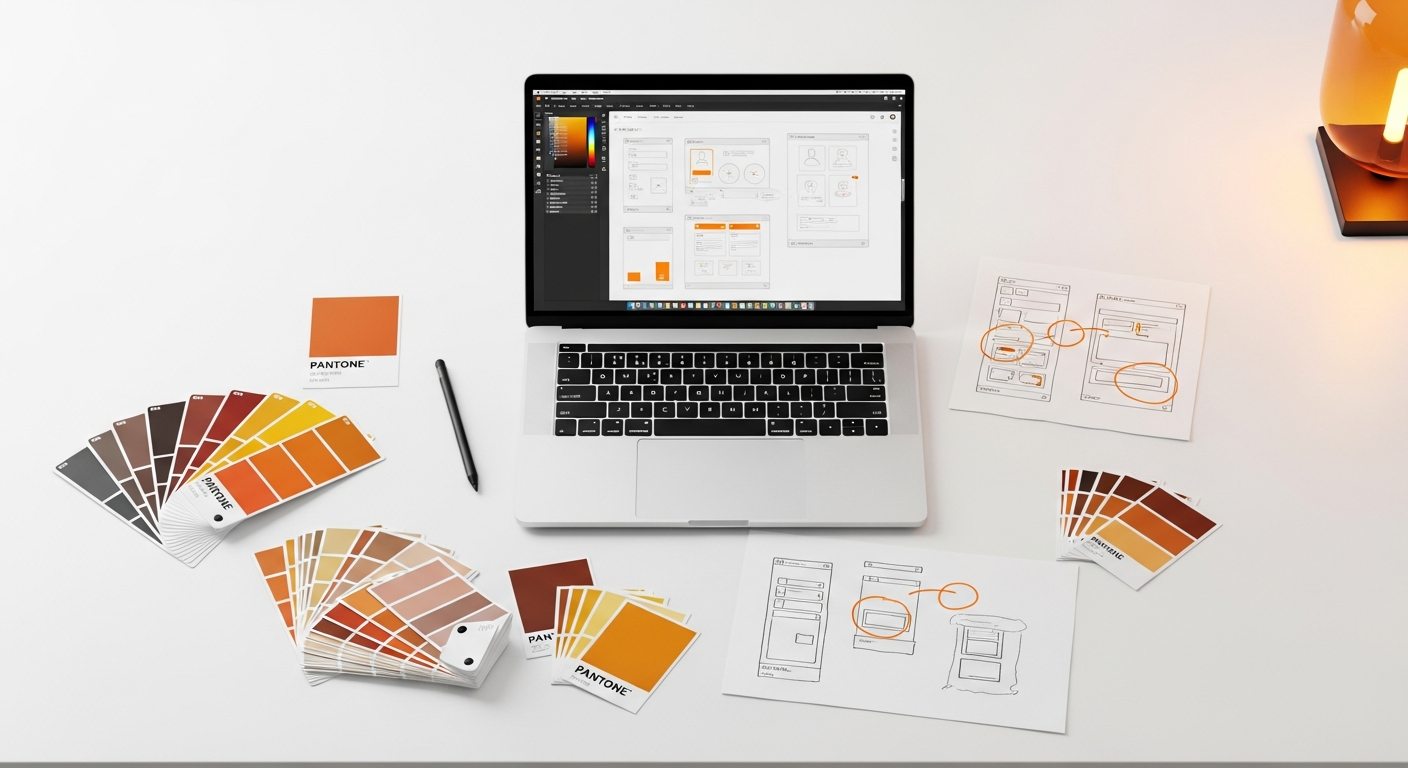
- Figma: Figma offers excellent support for variable fonts. Once a variable font is installed (or if it’s a Google Font, which Figma supports natively), you can often access its axes directly within the text panel. You’ll typically find sliders or input fields for weight, width, and sometimes custom axes, allowing for real-time adjustments. This makes Figma an ideal environment for experimenting with variable font styling.
- Sketch: Sketch also provides good support for variable fonts. Similar to Figma, you can access and manipulate variable font axes through the Type panel, usually under advanced typographic features. This allows designers to explore different variations directly within their artboards.
- Adobe XD: Adobe XD supports variable fonts, allowing designers to utilize their flexibility for responsive layouts and dynamic text elements. You can adjust the available axes within the character panel, though the interface might vary slightly from other tools.
- Adobe Illustrator/Photoshop: As professional typography tools, Illustrator and Photoshop have robust variable font support. You can access all available axes through the Character panel, often with more granular control and visualization options, making them great for initial type exploration and detailed type design work.
Prototyping with Variable Fonts:
While static mockups in design tools are useful, the true power of variable fonts shines in interactive prototypes. This is where you can demonstrate their dynamic capabilities, especially for animations and responsive behaviors.
- High-Fidelity Prototyping Tools (e.g., Framer, Principle):
- Framer: Being a code-based design tool, Framer offers perhaps the most comprehensive control over variable fonts in prototypes. You can directly manipulate font-variation-settings in CSS, allowing for complex animations and interactions driven by variable font axes. This is where you can truly showcase dynamic changes based on user input, scroll position, or other triggers.
- Principle: While not directly supporting variable font axes for animation as easily as Framer, you can often prepare different states of text with varying font weights/widths from your design tool and then animate the transition between these states in Principle, simulating a variable font effect.
- Web-based Prototyping (e.g., Webflow, HTML/CSS/JS):
- Webflow: With its growing capabilities, Webflow allows you to embed variable fonts and control their axes through custom CSS or even its visual interface for basic properties like weight and width. This is excellent for creating production-ready prototypes that demonstrate responsive typography in a browser environment.
- Direct HTML/CSS/JavaScript: For the most advanced and precise control, building prototypes directly with web technologies is unparalleled. You can use CSS properties like
font-variation-settingsto precisely control each axis and JavaScript to animate these settings based on user interaction or other logic. This is the ultimate environment for testing and showcasing the full potential of variable fonts.
Best Practices for Integration:
- Choose Your Font Wisely: Not all variable fonts are created equal. Select fonts that offer a wide range of axes and are well-designed across their entire variation space. Google Fonts offers a growing collection of high-quality variable fonts.
- Maintain Consistency: Define specific breakpoints and corresponding variable font settings within your design system. This ensures that the typography remains consistent from design files through to high-fidelity prototypes and final production.
- Communicate with Developers: Clearly document the variable font usage, including specific axis values and any animation logic. Providing developers with the exact CSS properties will ensure your designs are implemented accurately.
- Test Early and Often: Test your variable font prototypes across different browsers, devices, and operating systems to catch any rendering inconsistencies or performance issues.
By thoughtfully integrating variable fonts into your design and prototyping workflow, you unlock a new dimension of typographic control, leading to more dynamic, performant, and user-centric designs.
Enhancing User Experience (UX) with Variable Fonts
The true power of variable fonts lies not just in their technical elegance but in their profound impact on user experience. By offering unprecedented flexibility, they enable designers to craft more accessible, readable, and engaging interfaces that adapt intelligently to user needs and contexts.
Accessibility and Readability:
Variable fonts are a significant boon for accessibility, aligning perfectly with guidelines from organizations like the Nielsen Norman Group and WCAG (Web Content Accessibility Guidelines).
- Granular Weight Control for Contrast: The ability to fine-tune font weight by minute increments allows designers to achieve optimal contrast ratios for text against backgrounds, crucial for users with low vision. Instead of being limited to “regular” or “bold,” you can select the exact weight that offers the best readability without being too heavy or too light, improving adherence to WCAG 2.1 success criterion 1.4.3 (Contrast Minimum).
- Optical Sizing for Legibility: The optical size axis (opsz) is perhaps one of the most powerful features for readability. Typefaces are often designed with specific sizes in mind. A font optimized for headlines might look clunky as body text, and vice versa. Variable fonts with an optical size axis can automatically or manually adjust character shapes, stroke contrast, and spacing to maintain optimal legibility at any given font size. This means a headline can have robust, distinct letterforms, while the same typeface used for small print can have wider counters and more open spacing, preventing text from becoming a blurry mass.
- User-Controlled Customization: Imagine empowering users to adjust the font weight or width of text to their personal preference. For users with dyslexia or certain visual impairments, having the ability to slightly adjust the character spacing or weight can significantly improve their reading experience. This level of personalization moves beyond simple text resizing and offers a more nuanced control, fostering a truly inclusive design.
Responsiveness and Adaptability:
Modern interfaces must be fluid, adapting seamlessly across a myriad of devices and screen sizes. Variable fonts elevate responsive typography to a new level.
- Fluid Adaptation Across Breakpoints: Instead of jumping between a limited set of font weights or widths at predefined breakpoints, variable fonts allow for smooth, continuous transitions. You can subtly adjust the weight or width of text as the screen size changes, ensuring optimal line length and visual density without jarring shifts. This creates a more harmonious and less distracting reading experience, a principle often emphasized in Material Design’s adaptive type guidelines.
- Micro-Adjustments for Optimal Line Length: Fine-tuning the width axis can help maintain ideal line lengths (typically 45-75 characters for optimal readability, as suggested by NN/g). If a line is too short, you can slightly condense the text; if it’s too long, you can expand it, all without changing the font size or introducing awkward word breaks.
- Adapting to User Preferences: Beyond screen size, variable fonts can respond to user system preferences like “reduced motion” or “dark mode.” Typography can subtly shift its characteristics to better suit these environmental variables, enhancing comfort and usability.
Emotional Impact and Brand Expression:
Typography is a powerful tool for conveying brand personality and guiding user attention. Variable fonts amplify this capability.
- Dynamic Visual Hierarchy: Use the weight and width axes to create highly nuanced visual hierarchies. You can emphasize specific words or phrases with subtle shifts in weight or width, drawing the user’s eye precisely where you want it to go, without resorting to drastic font size changes or multiple static font files.
- Expressive Micro-interactions: Animate font axes in response to user actions (hover, click, scroll) to create delightful and informative micro-interactions. A button’s text could subtly “flex” on hover, or a navigation item could grow in weight when active, adding a layer of polish and engagement that reinforces the brand’s dynamic nature.
- Consistent Brand Voice: By using a single variable font file across all touchpoints, you ensure a consistent and cohesive typographic brand voice, regardless of the context or platform. This reinforces brand identity and builds trust with users.
By thoughtfully applying variable fonts, designers can move beyond static typography to create truly dynamic, responsive, and human-centered interfaces that anticipate and adapt to user needs, ultimately leading to a superior user experience.
Performance Benefits and Production Readiness

While the design flexibility of variable fonts is exciting, their performance advantages in a production environment are arguably even more critical. In an age where page load speed directly impacts user retention, SEO, and conversion rates, optimizing every byte is paramount. Variable fonts offer a significant leap forward in web performance.
Reduced File Size and Fewer HTTP Requests:
This is the cornerstone of variable fonts’ performance benefit. Consider a typical website that uses multiple weights and styles of a single typeface:
- Regular
- Italic
- Semibold
- Semibold Italic
- Bold
- Bold Italic
Each of these would traditionally be a separate font file (e.g., font-regular.woff2, font-bold.woff2, etc.). If each file is, say, 30KB, you’re looking at 180KB just for these six variations, plus six separate HTTP requests for the browser to fetch them. This adds up quickly, especially if you use multiple typefaces or more variations.
A variable font, however, consolidates all these variations (and infinitely more) into a single file. A well-optimized variable font might be 60-100KB for an entire family, encompassing all weights, widths, and even optical sizes. This translates to:
- Significantly Smaller Total File Size: You’re often loading 50-80% less font data compared to a similar range of static fonts. This directly impacts overall page weight.
- Fewer HTTP Requests: Instead of multiple requests, the browser makes just one request to fetch the entire font family. Reducing HTTP requests is a fundamental optimization technique for faster page loads, as each request incurs overhead.
These gains are particularly impactful for mobile users on slower networks, contributing to a better perceived performance and reducing data consumption.
CSS Implementation and Browser Support:
Implementing variable fonts in production is straightforward using standard CSS. The core property for controlling variation axes is font-variation-settings, though some common axes have dedicated, more user-friendly properties.
Example CSS:
@font-face {
  font-family: 'MyVariableFont';
  src: url('MyVariableFont.woff2') format('woff2');
  font-weight: 100 900; /* Defines the min and max weight range */
  font-stretch: 50% 200%; /* Defines the min and max width range */
  /* Add other axes as needed */
  font-display: swap; /* Important for performance and UX */
}

body {
  font-family: 'MyVariableFont', sans-serif;
  font-weight: 400; /* Regular weight */
  font-stretch: 100%; /* Normal width */
}

h1 {
  font-weight: 700; /* Bold */
  font-variation-settings: 'wght' 700, 'wdth' 120; /* Explicitly set weight and expand width */
}

.condensed-text {
  font-variation-settings: 'wdth' 70; /* Condense the text */
}

@media (max-width: 768px) {
  h1 {
    font-variation-settings: 'wght' 600, 'wdth' 100; /* Slightly less bold and normal width on smaller screens */
  }
}
The font-variation-settings property takes a comma-separated list of axis tags and their values. For standard axes like weight and width, you can also use the familiar font-weight and font-stretch properties, which map directly to the ‘wght’ and ‘wdth’ axes if the variable font supports them. This provides excellent backward compatibility and ease of use.
Browser Support: Modern browser support for variable fonts is excellent. All major browsers – Chrome, Firefox, Safari, Edge, and Opera – fully support variable fonts. This widespread adoption means you can confidently use them in production without significant compatibility concerns for the vast majority of your audience. For very old or niche browsers, a robust fallback strategy using a static font is always recommended.
Easier Maintenance and Updates:
Managing typography within a design system becomes simpler with variable fonts. If a type designer makes an update or adds a new axis, you only need to update a single font file. This reduces the overhead of maintaining numerous static font files and ensures that design changes are propagated more efficiently across your product. It also reduces the chances of inconsistencies arising from different versions of static fonts being used in various parts of an application.
Considerations for Production:
- Font Loading Strategy: Utilize
font-display: swap;or other font-display values in your@font-facerule to manage how fonts load and prevent invisible text during loading (FOIT). - Fallback Fonts: Always include a generic font family (e.g.,
sans-serif) as a fallback in your CSS. For older browsers that don’t support variable fonts, you can use feature queries (@supports) to serve a static version of the font if necessary, though this is becoming less common. - Subsetting: For even greater performance, consider subsetting your variable font to include only the characters you need (e.g., Latin alphabet, numbers, common symbols). Many font services and tools offer this optimization.
By embracing variable fonts, development teams can deliver faster, more robust, and more maintainable typography, directly contributing to a superior user experience and meeting modern web performance standards.
Advanced Prototyping Techniques and Interactive Use Cases
Variable fonts truly come alive in advanced prototypes, where their dynamic nature can be fully explored and demonstrated. Moving beyond static adjustments, designers can leverage variable fonts for intricate animations, data visualizations, and highly interactive user experiences that were previously difficult or impossible to achieve.
Animating Font Axes for Micro-interactions:
The ability to smoothly interpolate between axis values opens up a wealth of animation possibilities:
- Hover Effects: Animate the weight, width, or slant of text on hover for interactive elements like navigation links, buttons, or call-to-action text. A subtle increase in weight or a gentle expansion in width can provide delightful feedback, indicating interactivity without being overly distracting.
- Loading States: Use variable fonts to create engaging loading animations. Text could rhythmically pulse its weight, or characters could subtly “breathe” by adjusting their width, making waiting times feel less tedious.
- Scroll-Triggered Typography: As users scroll down a page, text elements could progressively reveal themselves by increasing their weight, expanding their width, or adjusting their optical size. This can create a narrative flow and guide the user’s attention through content.
- Input Field Feedback: When a user types into an input field, the placeholder text could subtly change its weight or width, or the entered text itself could animate slightly, providing immediate visual feedback.
Tools like Framer, which allow direct manipulation of CSS properties, are ideal for creating these kinds of detailed, code-driven animations. Even design tools with animation capabilities (like Adobe After Effects for motion graphics, or Principle for simpler UI animations) can be used to simulate these effects by preparing keyframes with different variable font settings.
Data Visualization with Variable Fonts:
This is a more experimental but incredibly powerful use case. Variable fonts can visually represent data points directly within text:
- Mapping Data to Axes: Imagine a stock ticker where the price change is represented not just by a number, but by the weight of the font. A significant positive change could make the number bold and wide, while a negative change could make it light and condensed.
- Sentiment Analysis: In a review section, the sentiment score could influence the “happiness” or “anger” axis of a custom variable font, subtly changing the appearance of the review text itself to reflect its emotional tone.
- Progress Indicators: A progress bar could use the width axis of text to visually represent completion. As a task progresses, the text “Loading…” could gradually expand in width.
This approach transforms text from a static label into a dynamic data visualization element, adding richness and immediacy to information display.
User Input-Driven Typography:
Empowering users to customize their typography experience is a hallmark of truly inclusive design.
- Accessibility Settings: Provide UI controls (sliders, toggles) that allow users to adjust the font weight, width, or optical size to suit their personal preferences. This goes beyond simple “larger text” options and offers fine-grained control, catering to diverse visual needs.
- Creative Exploration Tools: For applications focused on design or content creation, variable fonts can be a core feature. Users could interactively explore different typographic styles, adjusting axes in real-time to find the perfect look for their project.
Tools and Techniques for Advanced Prototyping:
- Framer: As mentioned, Framer’s code-centric nature (React, CSS) makes it perfect for implementing complex variable font animations and interactions using JavaScript to manipulate
font-variation-settings. - SVG and Lottie: Variable fonts can be embedded within SVGs. This opens up possibilities for animating text paths or individual characters using tools like Lottie (for After Effects animations exported to web), where the variable font properties can be animated over time.
- GreenSock Animation Platform (GSAP): For web-based prototypes, GSAP is an industry-standard JavaScript animation library that can smoothly animate CSS properties, including
font-variation-settings, allowing for highly performant and complex typographic animations. - CSS `transition` and `animation`: For simpler effects, native CSS transitions and animations can be applied directly to
font-variation-settings, providing smooth changes in font properties on hover, focus, or other states.
By mastering these advanced prototyping techniques, you can effectively communicate the dynamic potential of variable fonts to stakeholders and users, moving beyond static mockups to truly interactive and engaging experiences.
Challenges and Considerations When Adopting Variable Fonts
While variable fonts offer immense advantages, their adoption isn’t without its challenges. Being aware of these potential pitfalls and planning for them will ensure a smoother integration into your UI/UX design process and production pipeline.
1. Learning Curve for Designers and Developers:
- Designer Adaptation: Designers are accustomed to selecting predefined font weights and styles. The concept of continuous axes and granular control requires a shift in mindset and a new approach to typographic exploration. Understanding how different axes interact and how to apply them subtly for optimal UX takes practice.
- Developer Implementation: While basic CSS implementation is straightforward, animating variable font axes or building complex interactive typography requires a deeper understanding of CSS
font-variation-settings, JavaScript, and animation libraries. Developers need to learn new techniques for handling font loading and ensuring performance.
2. Font Licensing Complexities:
Licensing for variable fonts can sometimes be more complex than for static fonts. Some foundries offer different licensing models for variable fonts, or their variable font offerings might be separate from their static font packages. Always:
- Read Licenses Carefully: Ensure the license covers your intended use cases, including web embedding, desktop design, and any potential modifications or subsetting.
- Consider Open-Source Options: Google Fonts provides a growing library of high-quality open-source variable fonts, simplifying licensing concerns for many projects.
3. Browser Compatibility and Fallback Strategies:
While modern browser support for variable fonts is excellent, you still need to consider edge cases:
- Older Browsers: Very old browsers or niche rendering engines might not support variable fonts.
- Fallback Plan: Implement a robust fallback strategy using
@supportsrules in CSS to detect variable font support. If not supported, serve static font files as a graceful degradation. Always specify a generic font family (e.g.,sans-serif) as a final fallback. - Testing: Thoroughly test your variable font implementation across your target browser matrix to identify and address any rendering inconsistencies.
4. Tool Support Fragmentation:
While major design tools are improving, the level of support for variable fonts can still vary:
- Axis Control: Some tools might only expose standard axes (weight, width) and hide custom axes, limiting your design exploration.
- Prototyping Limitations: High-fidelity prototyping tools might not offer direct animation of variable font axes without resorting to code.
- Consistency Across Tools: Ensuring that variable font settings translate perfectly between your design tool, prototyping tool, and developer handover can sometimes require careful attention and documentation.
5. Overuse or Misuse Leading to Poor UX:
Just because you *can* animate or vary a font doesn’t mean you *should* in every instance. Excessive or poorly executed variable font effects can:
- Increase Cognitive Load: Overly dynamic text can be distracting and make it harder for users to focus on content, violating principles of good usability as highlighted by the Nielsen Norman Group.
- Reduce Readability: Inappropriate use of extreme weights or widths, or poorly timed animations, can hinder legibility and accessibility.
- Feel Gimmicky: If not used thoughtfully, variable font animations can come across as a superficial novelty rather than an enhancement to the user experience.
Always prioritize readability, clarity, and user comfort. Use variable fonts to enhance, not detract from, the core message and usability of your interface.
6. File Size of Complex Variable Fonts:
While variable fonts generally offer file size advantages, highly complex variable fonts with many axes and a large character set can still be substantial. It’s important to:
- Evaluate Trade-offs: Weigh the design flexibility against the potential file size for specific fonts.
- Subset if Possible: If you only need a specific range of characters, subsetting the variable font can further reduce its size.
By proactively addressing these challenges, you can smoothly integrate variable fonts into your workflow, harnessing their power while mitigating potential roadblocks.