
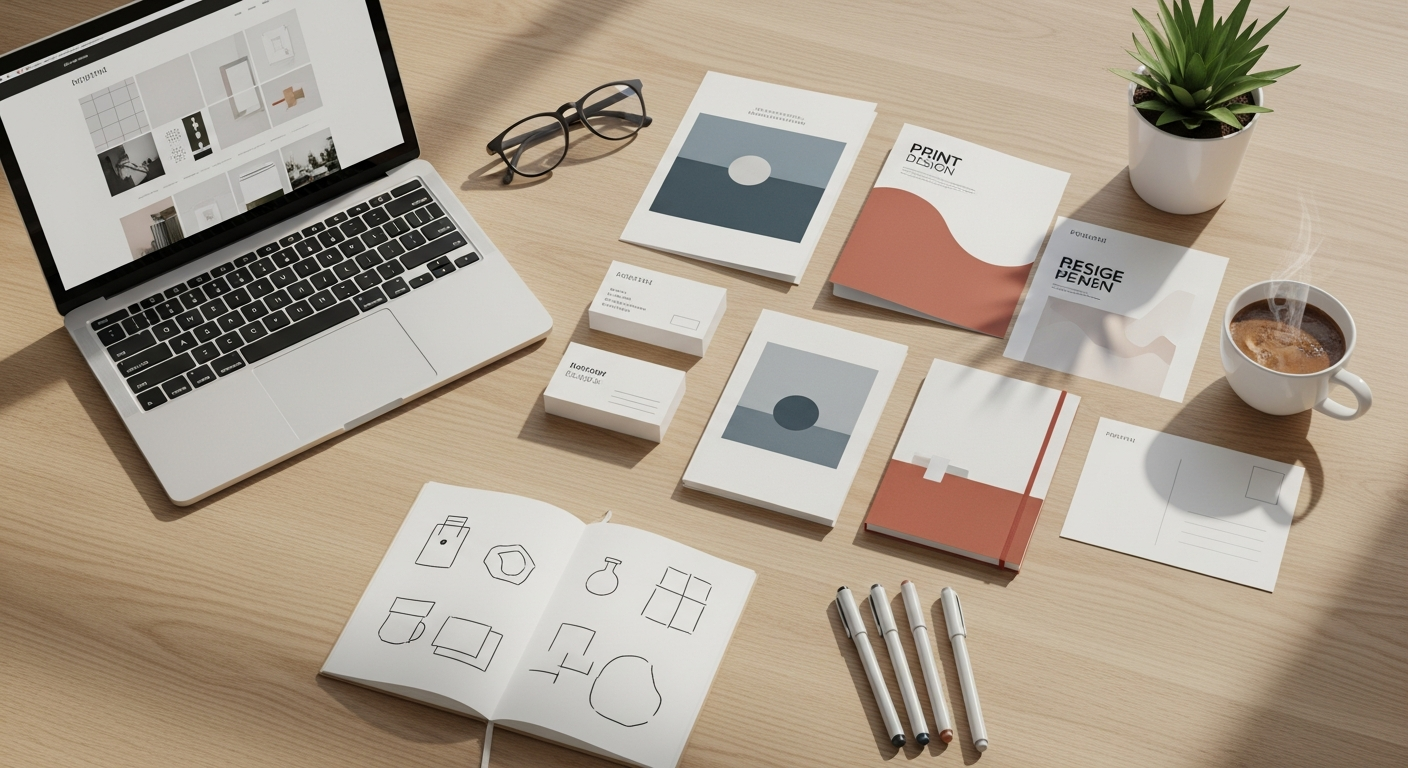
Understanding the Core Difference: Pixels vs. DPI
At the heart of distinguishing web from print design lies a fundamental concept: how images and graphics are constructed and displayed. This boils down to understanding pixels for web and DPI (Dots Per Inch) for print, along with the crucial role of color models.
Pixels and Web Design: The Digital Canvas
For web design, your canvas is inherently digital, made up of tiny squares of color known as pixels. These pixels are the smallest controllable elements of a picture represented on the screen. When we talk about screen resolution (e.g., 1920×1080), we’re referring to the number of pixels displayed horizontally and vertically. The more pixels per inch on a screen, the sharper the image appears, but the actual size of a pixel is relative to the device. What looks crisp on a high-resolution retina display might appear less so on an older monitor, but the underlying pixel count of the image remains the same.
The primary color model for web and digital displays is RGB (Red, Green, Blue). This additive color model works by combining varying intensities of red, green, and blue light to create a vast spectrum of colors. When all three are at their maximum intensity, they produce white; when all are absent, they produce black. RGB is ideal for screens because screens emit light, making it the most accurate representation of what users will see on their devices.
Key considerations for web design and pixels:
- Resolution Independence: While images have a fixed pixel dimension, web design often strives for responsiveness, meaning layouts and elements adapt to different screen sizes. Vector graphics (like SVGs) are resolution-independent, scaling perfectly without pixelation.
- File Size: Pixels contribute to file size. For web, optimizing images for smaller file sizes (e.g., using WebP, JPEG, PNG formats with appropriate compression) is crucial for fast loading times and a good user experience.
- Device Variation: A design must account for how it appears across a multitude of devices, from smartphones to large desktop monitors, each with varying pixel densities.
DPI and Print Design: The Tangible Output
When it comes to print design, the game changes entirely. Here, we’re concerned with DPI (Dots Per Inch), which refers to the number of ink dots a printer places within a one-inch line on a physical medium. Unlike pixels, which are displayed, dots are physically printed. A higher DPI means more dots per inch, resulting in a finer, more detailed, and higher-quality print. For most professional print jobs, a minimum of 300 DPI is recommended for images to appear sharp and clear, preventing pixelation or blurriness.
The color model for print is predominantly CMYK (Cyan, Magenta, Yellow, Key/Black). This is a subtractive color model, meaning colors are created by absorbing (subtracting) certain wavelengths of light and reflecting others. Printers lay down tiny dots of these four ink colors to create the full spectrum. When all four inks are combined at maximum intensity, they theoretically produce black (though often a “rich black” using all four is preferred for deeper tones); when no ink is applied, the paper’s white shows through. CMYK is essential because it accurately represents how colors will appear when mixed with physical inks on paper, which reflects light rather than emits it.
Key considerations for print design and DPI:
- Physical Size: The physical dimensions of the print (e.g., A4, letter, business card) directly impact the required DPI. A small image at 300 DPI will have fewer pixels than a large image at 300 DPI, but both will print sharply.
- Image Quality: Raster images (like photographs) must have sufficient DPI at their intended print size. Upscaling a low-DPI image for print will result in noticeable pixelation.
- Color Accuracy: CMYK conversion is critical. Colors seen on an RGB screen may not exactly match their CMYK printed counterparts, necessitating color proofing.
PPI (Pixels Per Inch): Bridging the Terminology
It’s worth briefly touching on PPI (Pixels Per Inch). While often confused with DPI, PPI specifically refers to the pixel density of an image or a digital display. An image might be 300 PPI, meaning it has 300 pixels packed into every inch of its digital representation. When this image is sent to a printer, the printer interprets that digital information and translates it into physical ink dots (DPI). So, while related, PPI describes the image’s digital resolution, and DPI describes the printer’s output resolution.
Understanding these distinctions is the bedrock of successful design. Neglecting these core differences can lead to frustrating outcomes, from blurry websites to pixelated brochures. As you embark on any design project, always consider the final medium first, as this will dictate your initial setup and asset requirements.
Web Design Essentials: Optimizing for the Screen
Crafting designs for the web means embracing a fluid, interactive, and ever-evolving medium. The goal is to create experiences that are not only visually appealing but also highly functional, accessible, and performant across a myriad of devices. Here’s what you need to master for web design in 2026.
Resolution and Image Optimization
Unlike print, where fixed dimensions are king, web design demands flexibility. Images need to be optimized for various screen resolutions and device types while maintaining visual quality and fast load times. This involves:
- Responsive Images: Using HTML attributes like
srcsetandsizesto serve different image files based on the user’s screen resolution and viewport size. This ensures smaller images are loaded on mobile devices, saving bandwidth. - Modern Image Formats: Beyond traditional JPEGs and PNGs, embrace formats like WebP for superior compression and quality, and AVIF as it gains broader browser support. SVGs (Scalable Vector Graphics) are indispensable for logos, icons, and illustrations due to their resolution independence.
- Compression: Employing lossy and lossless compression techniques to reduce file sizes without significant perceptual quality loss. Tools and build processes often automate this.
- Lazy Loading: Implementing lazy loading for images and videos that are not immediately visible in the viewport, improving initial page load speed.
Color Palettes and Accessibility
Web colors operate within the RGB spectrum, typically defined by hexadecimal codes (e.g., #FFFFFF for white) or RGBa values (including an alpha channel for transparency). Beyond aesthetics, color choices profoundly impact user experience and accessibility.
- Accessibility Standards: Adhere to WCAG (Web Content Accessibility Guidelines) for color contrast. Ensure sufficient contrast between text and background colors so that users with visual impairments can easily read content. Tools exist to check contrast ratios.
- Brand Consistency: While RGB offers a vast palette, ensure your digital brand colors are consistent and reflect your overall brand identity.
- Emotional Impact: Leverage color psychology to evoke desired emotions and guide user behavior.
Typography for the Digital Realm
Web typography is about more than just choosing a pretty font; it’s about readability, performance, and responsive scaling.
- Web-Safe Fonts vs. Web Fonts: While web-safe fonts (like Arial, Times New Roman) are universally available, web fonts (like Google Fonts, Adobe Fonts) offer greater creative freedom. However, web fonts require loading, impacting performance.
- Variable Fonts: A significant advancement, variable fonts allow a single font file to contain multiple stylistic variations (weight, width, slant), reducing file size and offering immense design flexibility. This is a game-changer for responsive typography in 2026.
- Readability: Prioritize legibility. Consider font size, line height (leading), letter spacing (kerning), and line length for optimal reading comfort across devices.
- Font Loading Strategies: Implement strategies like
font-display: swapor preloading critical fonts to prevent Flash of Unstyled Text (FOUT) or Flash of Invisible Text (FOIT).
Layout and Responsiveness: The Adaptive Canvas
The web is inherently responsive, meaning designs must adapt gracefully to different screen sizes and orientations. This is a core tenet of modern web design.
- Mobile-First Approach: Designing for the smallest screen first and progressively enhancing for larger screens is a best practice. This forces you to prioritize content and functionality.
- Grid Systems and Flexbox/CSS Grid: Utilize CSS Grid and Flexbox for robust and flexible layout management. These tools allow for complex, responsive layouts with minimal code.
- Viewport Units: Employ units like
vw(viewport width) andvh(viewport height) for elements that scale proportionally with the browser window, enhancing fluidity. - Interactive Elements: Plan for hover states, active states, and focus states for interactive elements (buttons, links) to provide clear feedback to users.
By focusing on these web design essentials, you’ll create digital experiences that are not only beautiful but also performant, accessible, and user-friendly, setting a high standard for your online presence.
Print Design Fundamentals: Preparing for Physical Output
Resolution and Image Quality for Print
The most critical factor for print image quality is resolution. Unlike the web’s 72 PPI standard for display, print demands much higher detail to avoid pixelation.
- Minimum DPI: For high-quality print, images should generally be 300 DPI (Dots Per Inch) at their final intended print size. For large format prints (like billboards), lower DPI might be acceptable as viewing distance increases, but for standard collateral (brochures, magazines, business cards), 300 DPI is the gold standard.
- Vector vs. Raster: Always prioritize vector graphics (created in software like Adobe Illustrator) for logos, illustrations, and typography. Vector graphics are resolution-independent, meaning they can be scaled to any size without losing quality. Raster images (photographs, complex graphics from Photoshop) are pixel-based and must be created or acquired at a sufficiently high resolution.
- Image Formats: For print, common image formats include TIFF (for high-quality raster images, supports layers and transparency), EPS (for vector graphics, often used for logos), and high-resolution JPEG (for photographs where file size needs to be managed, but be aware of lossy compression artifacts). PDF/X formats are often used for final print-ready files.
Color Modes: CMYK and Spot Colors
The color model for print is fundamentally different from web. This is where many designers new to print make critical errors.
- CMYK (Cyan, Magenta, Yellow, Key/Black): All process printing uses CMYK inks. Your design files should be converted to CMYK before sending to print to accurately represent how colors will appear. RGB colors on screen can often look vibrant and saturated, but when converted to CMYK, they may appear duller or “washed out” because the CMYK gamut (range of reproducible colors) is smaller than RGB.
- Spot Colors (Pantone): For brand-critical colors, metallic inks, or specific vibrant hues that are difficult to achieve consistently with CMYK, spot colors (like those from the Pantone Matching System) are used. These are pre-mixed inks applied as a separate layer. If your brand guidelines specify Pantone colors, ensure they are correctly applied in your print files.
- Color Profiles: Use appropriate ICC color profiles (e.g., FOGRA, SWOP, GRACoL) to ensure color accuracy and consistency across different printing presses and regions.
- Rich Black: For a deep, saturated black in print, simply using 100% K (black) in CMYK is often insufficient and can look dull. A “rich black” is created by adding percentages of CMY inks (e.g., C:60%, M:40%, Y:40%, K:100%) to create a denser, more visually appealing black.
Typography for Legibility on Paper
Typography considerations for print focus heavily on legibility, aesthetics, and ensuring fonts are correctly embedded for the printer.
- Font Embedding: Always embed all fonts used in your design when creating print-ready PDFs. If fonts are not embedded, the printer’s system may substitute them, leading to unexpected layout shifts and incorrect appearance.
- Kerning and Leading: Adjusting the spacing between individual characters (kerning) and lines of text (leading) is crucial for optimal readability, especially in body text and headlines.
- Point Size: While web uses pixels, print uses point sizes (pt). Ensure font sizes are appropriate for the intended viewing distance and medium. For example, a business card will require smaller text than a poster.
- Font Licenses: Be aware of font licensing for commercial print use.
Layout, Bleed, and Trim: Precision is Key
Print design requires meticulous attention to the physical boundaries of the page.
- Bleed: This is extra space (typically 1/8 inch or 3mm) around the edges of your design that extends beyond the trim line. If your design has elements that go to the edge of the page, they must extend into the bleed area. This prevents unsightly white edges if the paper is cut slightly off during the printing process.
- Trim Line: This is the actual size your finished printed piece will be after it’s cut.
- Safe Zone/Margin: This is an area inside the trim line (typically 1/8 to 1/4 inch or 3-6mm) where important content (text, logos) should be placed. Keeping critical elements within the safe zone ensures they won’t be accidentally cut off.
- Margins: Consistent margins contribute to a clean, professional aesthetic and aid readability.
Paper Stocks and Finishes
The tactile experience of print is heavily influenced by the choice of paper and finishes.
- Paper Weight: Measured in pounds or GSM (grams per square meter), paper weight affects the feel and durability of the printed piece. Heavier stock generally conveys higher quality.
- Paper Finishes:
- Coated (Gloss, Matte, Silk): Coated papers have a surface treatment that can enhance color vibrancy (gloss) or reduce glare (matte/silk).
- Uncoated: Absorbs ink more, giving a softer, more natural look.
- Special Finishes: Consider options like embossing/debossing, foil stamping, spot UV, or die-cutting to add unique tactile and visual elements.
Before sending anything to the printer, always perform thorough pre-press checks, review proofs (digital and physical), and communicate clearly with your print vendor. This meticulous approach ensures that your print designs are as stunning in hand as they are on screen.
Bridging the Gap: Seamless Transition Strategies
In 2026, designers are increasingly expected to create assets that perform beautifully across both web and print. The most effective strategy is to approach projects with a ‘design for both’ mindset from the outset. This proactive approach minimizes rework, maintains brand consistency, and ensures high-quality output regardless of the medium.
Starting with the End in Mind: A Dual-Medium Approach
The biggest mistake designers make is creating for one medium and then trying to force it into another. Instead, when a project requires both web and print deliverables, plan for both from day one. This means:
- Initial Asset Creation: Always create your core assets (logos, key graphics, brand elements) at the highest possible resolution and in vector format whenever feasible. A vector logo, for instance, can be scaled infinitely for a billboard or shrunk for a favicon without quality loss.
- Brand Guidelines: Develop comprehensive brand guidelines that include specifications for both digital (RGB, hex codes, web-safe fonts, responsive considerations) and print (CMYK, Pantone, print-specific typography, minimum DPI for images).
- Content Strategy: Consider how text content will be adapted. Web content might be more concise and scannable, while print content could be more detailed and narrative.
Vector Graphics First: The Universal Language
As mentioned, vector graphics are your best friend when designing for both web and print. Software like Adobe Illustrator is specifically designed for creating scalable vector artwork. Using vectors for:
- Logos: Essential for consistent brand identity.
- Icons: Can be used as SVGs on the web and embedded directly into print layouts.
- Illustrations: Provide crisp lines and colors across all mediums.
When you start with a vector, you can easily export it to various raster formats (JPEG, PNG, WebP) at different resolutions for web, or embed it directly into print-ready files without worrying about pixelation.
High-Resolution Raster Assets: Downscale, Don’t Upscale
For raster images (like photographs), the rule of thumb is always to start with the highest resolution possible. Acquire or create images that meet or exceed the 300 DPI requirement for print at their largest intended size.
- Source Files: If you’re using stock photography, download the largest available size. If you’re commissioning photography, specify high-resolution deliverables.
- Downscaling for Web: Once you have high-res images, you can then downscale and compress them for web use. It’s always better to scale down a large image than to try and scale up a small one, which will inevitably lead to pixelation.
- Smart Objects (Photoshop): If using Photoshop, convert raster layers into Smart Objects. This preserves the original image data, allowing you to scale, rotate, and apply filters non-destructively, making it easier to adapt for different outputs.
Color Conversion and Management: Navigating the Gamut Gap
Converting colors from RGB (web) to CMYK (print) is one of the trickiest parts of bridging the gap. The difference in color gamut means some vibrant RGB colors simply cannot be reproduced in CMYK.
- Proofing: Always proof your colors. This means reviewing a physical print proof (hard proof) from your printer before the full run. Digital proofs are helpful but cannot fully replicate how colors will appear on paper.
- Color Management Systems (CMS): Utilize CMS within your design software (e.g., Adobe Creative Suite’s color settings) to ensure consistent color interpretation across devices and applications. Set your working color spaces correctly (e.g., sRGB for web, a specific CMYK profile for print).
- Spot Color Strategy: If precise color matching is paramount, especially for brand elements, consider incorporating Pantone spot colors into your print designs.
Consistent Branding: The Unifying Thread
Regardless of the medium, maintaining a consistent brand identity is crucial. This goes beyond just color and logo; it encompasses typography, imagery style, tone of voice, and overall aesthetic.
- Visual Language: Ensure the visual language—the style of photography, illustration, icon design—is consistent across web and print.
- User Experience (UX) on Web, Readability on Print: While the specifics differ, the underlying goal of clear communication and a positive user experience remains. For web, this means intuitive navigation and responsive layouts. For print, it means legible typography and clear visual hierarchy.
By implementing these seamless transition strategies, you can confidently create a cohesive and impactful design ecosystem that thrives in both the digital and physical realms, providing a consistent and professional experience for your audience.
Common Pitfalls and How to Avoid Them
Even experienced designers can fall victim to common errors when navigating the complexities of web and print. Understanding these pitfalls and implementing preventative measures is key to delivering high-quality, professional work. Just as there are things you should never neglect in your home to maintain its value and functionality, there are critical elements in design that demand your attention.
1. Low-Resolution Images in Print: The Pixelation Nightmare
This is arguably the most common and glaring error in print design. Using images that are too low in resolution (below 300 DPI at their intended print size) results in pixelated, blurry, and unprofessional output.
- How to Avoid:
- Always start with high-resolution images (300 DPI or higher) for print projects.
- If an image looks good on screen at 72 PPI, it doesn’t mean it’s suitable for print. Check the actual dimensions and resolution in your image editing software.
- Never “upscale” a low-resolution image hoping to improve its quality for print; it will only stretch the existing pixels, making the blurriness more pronounced.
- For logos and illustrations, prioritize vector formats (SVG, AI, EPS).
2. Incorrect Color Modes: Washed-Out or Unexpected Hues
Designing in RGB and then converting to CMYK at the last minute for print, or vice-versa, without proper management, can lead to significant color shifts.
- How to Avoid:
- Begin print projects in CMYK color mode from the start in your design software.
- Understand the limitations of the CMYK gamut; some vibrant RGB colors cannot be accurately reproduced in print. Adjust expectations and communicate this to clients.
- Utilize Pantone spot colors for critical brand colors where precise matching is essential.
- Always request and review a physical print proof to check color accuracy before a full print run.
- For web, ensure your colors are accessible and meet contrast standards.
3. Neglecting Bleed and Margins: Cut-Off Content and White Edges
Ignoring bleed, trim lines, and safe zones in print design is a recipe for disaster, resulting in text being cut off or unwanted white borders.
- How to Avoid:
- Always set up your document with adequate bleed (typically 1/8 inch or 3mm) for print designs where elements extend to the edge of the page.
- Extend all background colors, images, and design elements that are meant to go to the edge of the page into the bleed area.
- Keep all critical content (text, logos, important images) within the “safe zone” or internal margin, usually 1/8 to 1/4 inch inside the trim line.
- Communicate with your printer about their specific bleed and margin requirements.
4. Poor Typography Choices and Management: Unreadable Text
Choosing inappropriate fonts or failing to manage them correctly can severely impact readability on both web and print.
- How to Avoid:
- For Print: Always embed all fonts when creating print-ready PDFs. Failure to do so can lead to font substitution and layout changes. Pay attention to kerning, leading, and font size for legibility on paper.
- For Web: Use web-safe or well-optimized web fonts. Prioritize readability across different screen sizes and devices. Ensure proper line height and contrast. Consider variable fonts for efficiency and flexibility.
- Avoid using too many different fonts in a single design; stick to 2-3 complementary typefaces for consistency.
5. Ignoring Responsiveness (Web) or Readability (Print)
A design that looks great on a desktop monitor but breaks on mobile, or a print piece with text too small to read, indicates a failure to consider the medium’s specific demands.
- How to Avoid:
- For Web: Adopt a mobile-first design approach. Test your designs rigorously across various devices, browsers, and screen sizes. Use responsive design principles (fluid grids, flexible images, media queries).
- For Print: Conduct readability tests. Print out drafts to check text size, font choice, and color contrast under various lighting conditions. Consider the viewing distance and environment for the final piece.
6. Lack of Testing and Proofing
Skipping the crucial steps of testing (for web) or proofing (for print) is a gamble that rarely pays off.
- How to Avoid:
- For Web: Test website functionality, links, forms, and responsiveness across multiple browsers (Chrome, Firefox, Safari, Edge) and devices (desktop, tablet, mobile). Check for accessibility issues.
- For Print: Always get a final proof (preferably a hard copy) from your printer. Review every detail—text, images, colors, layout, spelling, punctuation—before approving the print run. A mistake caught at this stage is inexpensive; a mistake caught after printing is costly.
By being vigilant about these common pitfalls, you can significantly elevate the quality of your design work and ensure a smooth, successful outcome for both your digital and physical projects. Remember, attention to detail is the hallmark of a truly professional designer.
Future-Proofing Your Designs in 2026
The design landscape is in constant flux, driven by technological advancements, evolving user expectations, and a growing emphasis on sustainability. To truly excel in 2026 and beyond, designers must not only master current best practices but also anticipate and adapt to future trends. This proactive approach ensures your skills and your output remain relevant and impactful, much like when you consider are you ready to enhance your home with smart technology and
Recommended Resources
You might also enjoy How To Build A Mobile App For Your Business from Eamped.
For more on design 101 web, see Best Tools For Remote Collaboration 2026 on Bookmark Sharer.